Design Tokens Support Custom Layouts and Components for U.S. Web Design System (USWDS)
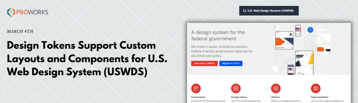
Recently we've had the opportunity to work with the U.S. Web Design System (USWDS) for the USDA Agricultural Research Service (USDA ARS) and the Economic Research Service (USDA ERS). Learning this system has been a valuable asset for us at ProWorks, and in particular the "Design Token" system has provided us with some great insights in how to create consistent layouts that fit the US Web Design Standards.
What is the USWDS? Well, from the creators themselves at https://designsystem.digital.gov/ it is:
"...a library of code, tools, and guidance to help government teams design and build fast, accessible, mobile-friendly government websites backed by user research and modern best practices."
I would describe it as an implementation or framework to easily create components and layouts that follow the US Web Design Standards by using "Tokens" in SCSS.
"Design Tokens" are really the heart of this useful system, where each token is like a key that unlocks a specific value. There are many ways to use tokens, which I am still learning, and the introduction to this topic is here https://designsystem.digital.gov/design-tokens/. Values are unlocked through a function, mixin, or utility class that exists in the core of the system (to me this is the magic, and I'll probably never understand how the mixins actually work). Tokens take all values of measurement and pack them into units that follow a consistent design system. It's used for almost everything, not just measurements, like font size, font family, and color. By using tokens you never have to enter an explicit value of units (eg. 20px, 2em, #5D5D5D), but instead use the intended mixin and token key.
For example, normally if you'd like to add padding right and left on an element, you'd write something like:
.my-element {
   padding-left: 1rem;
   padding-right: 1rem;
}
With the USWDS this is instead written like:
.my-element {
   @include u-padding-x(2);
}
(2) is the token used that outputs 1rem in this case, and is a great way to keep spacing and sizing consistent throughout the site, and between multiple U.S. branded sites. There are global settings available for spacing, sizing, and fonts that will all update to different screen sizes automatically with each token. This takes all the guesswork out of figuring out correct values for each screen size, just pick a token value and you're good!
Color tokens are similar. You don't need to find specific hex values, you just use tokens for colors that are available with the USWDS. Instead of:
.my-element {
   background-color: #c3512c;
}
It would be:
.my-element {
   background-color: color('red-warm-50');
}
This way you'll always be using colors that are included in the USWDS (don't worry, there's plenty to choose from!)
Of course the USWDS also comes with a pretty good library of components to use out-of-the-box. Entire header and footer components are available for example, with many options for customization. There's plenty of common UI elements to get you started. The full library is listed here https://designsystem.digital.gov/components/
The USWDS was a snap in building the USDA ARS Scientific Discoveries site at https://scientificdiscoveries.ars.usda.gov/ we were able to keep agile in component design, providing layout options that covered everything they needed, and new ideas for layouts that came up along the way. I am really impressed with the USWDS and continue to learn new ways of customizing layouts using it!
Have you any experience in using it?
What things have you learned that I may not have touched on?