An Easy Way To Test Your Website On Mobile and Tablet Views
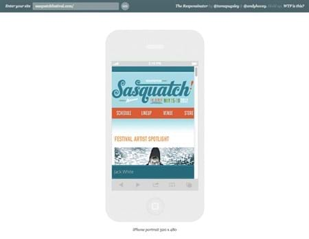
One website that I have found useful for testing mobile and responsive web designs is The Responsinator. It loads any website into common iOS, tablet, and Android device sizes for you to view how they might look. Its not a replacement for the actual devices as there could be quirky bugs that pop up. But as a quick look and test it does great.
Take a look at how it shows the Sasquatch Festival looks on all the different devices:
The Responsinator - Sasquatch Festival
comments powered by Disqus